I stumbled across this super informative video on colour theory applied to makeup, I just had to share!
Robert Jones explains the technical reasons why some blushes and lipsticks ‘work’ and others ‘clash’. He also provides an in depth explanation of eyeshadow pairings that emphasise different eye colours. Although I’m a big fan of well curated clashing, I think this is a perfect resource to provide clarity on harmonious colour combinations.
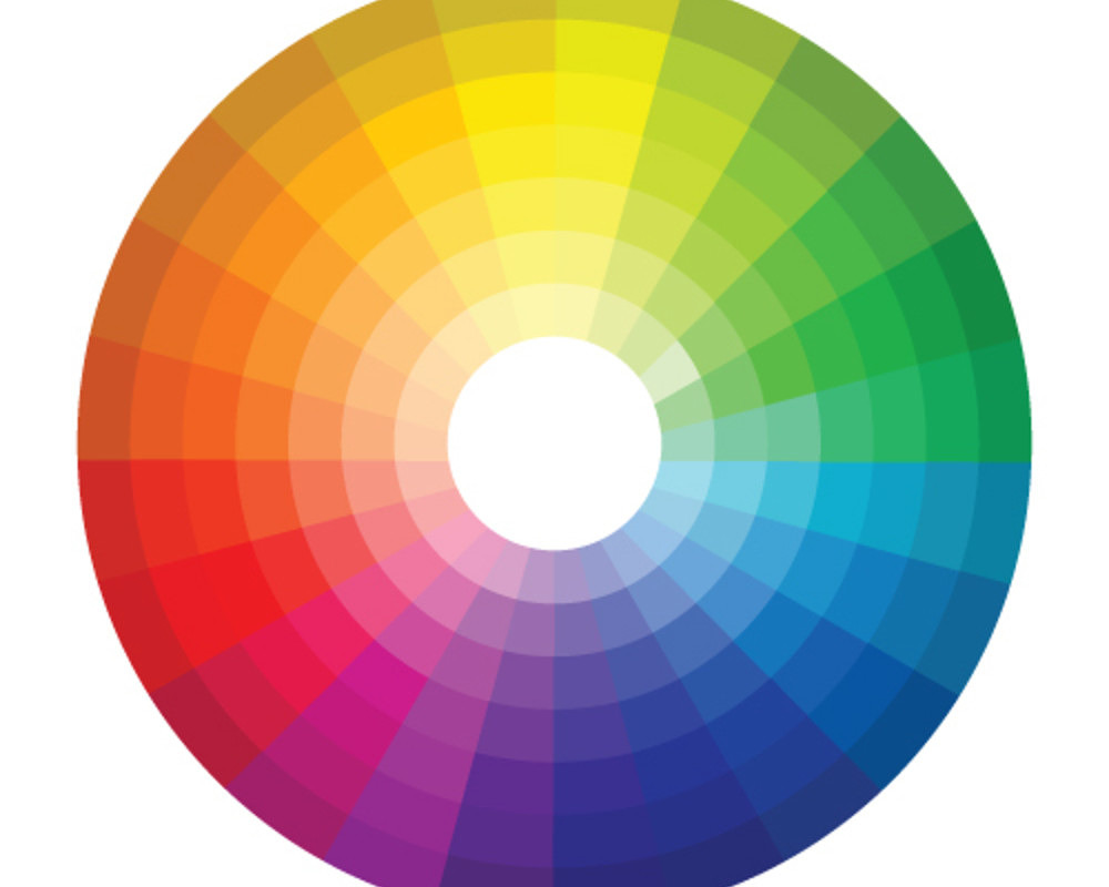
On a separate note, the video addresses how even conventionally ‘cool’ colours (like blue) can lie on the warmer spectrum.
I hope you enjoy this video as much as I do!
xxkarima

I went to college for art. This is pretty true. Skin tone obviously plays a big part too in eyeshadows and not just eye colour. The lipstick part was helpful for me. I often struggle with my skin tone amd skin hue being pale, I agree with what he says. Alot of colours can show up muddy on pale skin. Blushes darker than pale pinks and peaches can look like sunburns or skin rashes or even like bruises. Anyway, it is certainly useful info even for those who know colour theory to get a reminder, so thank you! <3
Absolutely, I agree, Nikole. There are so many factors that play into what colours you can wear (including preference!). This is a incomplete way of looking at it but it answers a lot of questions that people have about colour theory. I love that he mentioned cool/warm blues, I think this confuses many. <3 x
I was thinking the exact same as Nikole – I have blue/grey eyes, but the colours that would probably make them stand out look awful against my skin tone.
I found the vid very interesting though, thanks for sharing!
Skintone plays a huge part, including what colour under eye circles you have (mine are purple and purple shades can sometimes emphasise that). Interesting nonetheless! xx
Hi there 🙂
I did find this very interesting, and helpful, but there was one element that still leaves me somewhat clueless and confused – and that’s yellow.
I really do think that there are ‘cool’ yellows and ‘warm’ yellows, and if the definition of warmth is ‘more yellow’ then that would define yellow as a fundamentally warm color, which I don’t think I agree with. I think of ‘cool’ yellows being in the range of olive tones (usually darker) to ivory tones (fair but not at all pink).
This gets particularly tricky when it comes to looking for foundation shades!
But I loved that when he talked about making eye colors pop, he discusses eyes with a couple different colors going on, because so many of us have eyes like this. I’m going to be having fun trying to decide which shadows bring out different aspects of my eye color.
I think of red as the fundamentally warm colour and blue as the fundamentally cool colour. Warm yellows lean closer to the red end of the colour spectrum, while cool yellows lean closer to the blue/green end. I actually think MAC’s definition of warm vs cool is the most accurate because it considers the colour spectrum, I.e. pink is warmer than yellow; therefore, NW rightfully describes pink tones. Lots of people think MAC’s system is stupid, but I personally prefer it to what other makeup brands use. So yeh, I agree with you in that yellow isn’t a fundamentally warm colour; like most colours, it can be warm, cool or neutral depending on whether it leans closer to red or blue. That’s how I look at it anyway.
Very interesting video! Thank you for sharing.
Hi Jen,
Thanks for your response, it’s great food for thought. It’s funny, isn’t it, because red also has the warm and cool sides. Again when I think of pinker skin tones, I can imagine cool ones and warm ones. I wonder if this means that for me the fundamentally ‘warm’ color is … orange? I guess in a way this makes sense, being opposite from blue on the color wheel … but presents the problem of not being a primary color.